ShopDreamUp AI ArtDreamUp
Deviation Actions


Suggested Deviants


Suggested Collections


You Might Like…


Featured in Groups


Description
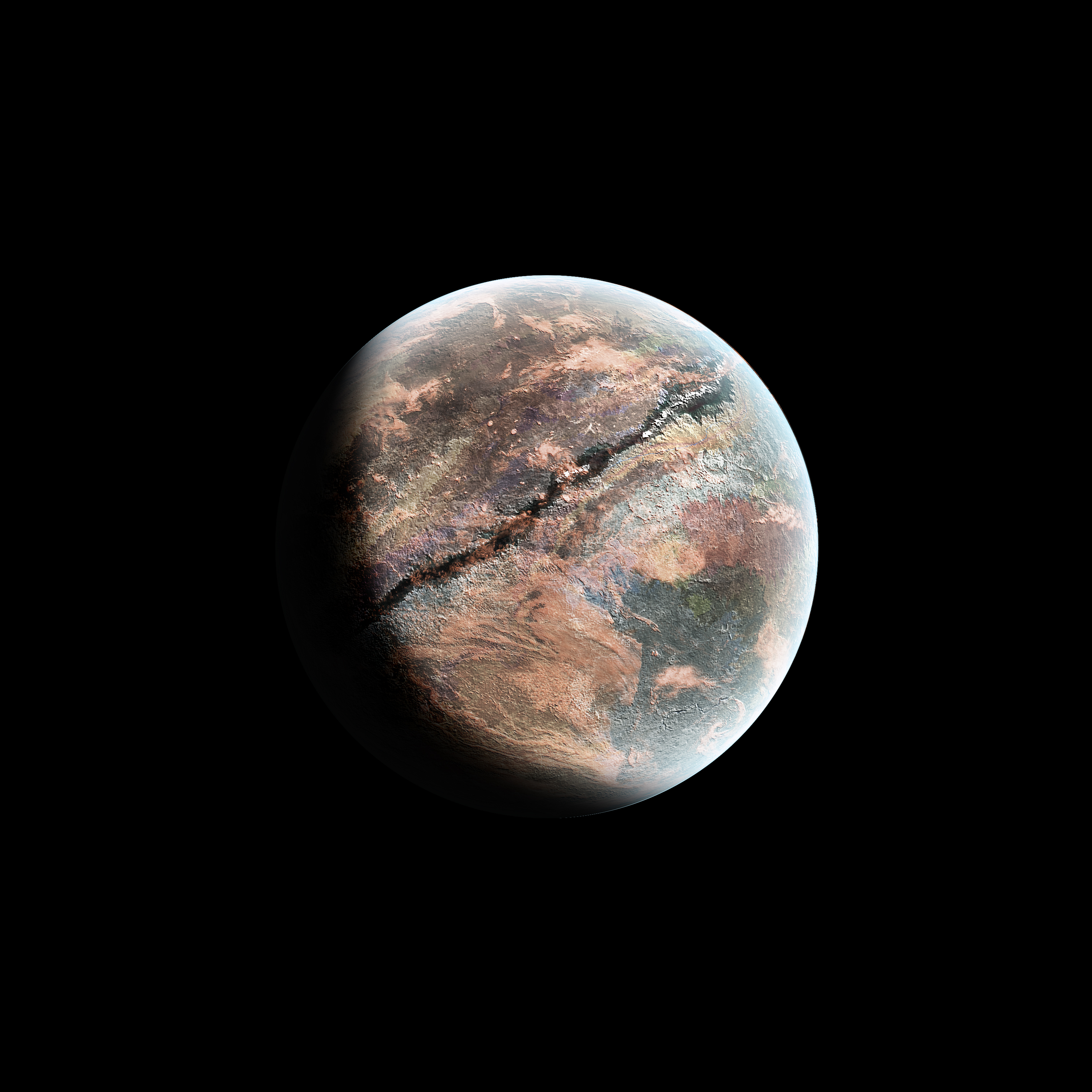
It is a planet. Use it as you wish, but I'd love to see how you did so!
Image size
3000x3000px 73.37 MB
Comments32
Join the community to add your comment. Already a deviant? Log In
Since I'm sincerely bored right now, I decided to write some critiques on random space art. I mean, why not? xD
Although I don't really find a use for Stock images, this one caught my attention due to numerous facts; And not just because it has potential for improvement but because it is already really good. I just want to point out how to make it even better. So let's get started (:
Since this is a Stock File, I will not rate the visional and artistic values of this image, since I doubt they were intentionally imported. So just imagine that I rated all the Criteria Bars on the right except for Vision.
The Texture is very detailed, which is something really important when making planets. So good job on that. I seriously need to make you a complement, because in order to achieve a non-distorted, enhanced texture, you need to make the original texture canvas around 5000x5000 pixels or even larger. Since almost no textures are that size, you need to repeat them or merge them with other textures.
But your texture looks pretty seamless and as if it was only one real texture. This suggests that you have either painted the texture yourself, you have made a good photography of a texture or you are just very good at making seamlessly seeming, borderless textures.
The Texture really tells a good story of the planet. It has much erosion on it, though the big dark crack which spreads in the middle is a bit too unrealistic. Try to make it not too dark.
The Planet overall looks not spherized enough, I think. You should always apply the spherize Filter twice. The first time, use 100% and the next time use 75% to 50%, depending on the texture and the size of the planet. If you use Photoshop Extended, you can use the 3D-Menu to make a perfect 3-Dimensional Sphere out of your texture (:
What I think looks very nice is how the color of the planet and the color of the Atmosphere differenciate, but it still doesn't look odd like it normally would. Try to increase the inner glow a bit more next time. The size of the outer glow is kept very nice and small and is not overwhelmingly huge, which is a common mistake in my opinion. The small and dim outer glow of the atmosphere makes the planet look really realistic and professional.
The thing that needs most improval is the shadow. Sorry if this sounds too harsh, but NEVER make the dark side of the Planet completely black. Never ever.
The stars and nebulae in the background also emit light, which is projected and reflected on the dark side of the planet, thus illuminating it a little bit.
Even if the background has almost no stars in it and is almost completely black, you should always at least add a little detail to the dark side of the planet, even if it's almost invisible.
This is very important because making the dark side of the planet black is like cutting away part of the planet and leaving it out completely. The dark side of the planet is the second part of the story. Like night and day, the light side and the dark side must be equally appreciated. The planet will then look much more eye-catching and simply well made.
What you should do is following:
Copy the texure layer of the planet and put it ontop of the shadow layer. Then, select the shadow contours, invert the selection and delete everything of the new texture layer which is outside the shadow.
Set this new texture layer to screen. Then, Press crtl/cmd + L to bring up the levels and play around with them until you have a dark and contrasted dark side. This should look pretty nice if you do it right.
There's nothing else to critizise I think.
Overall, this is a very professionally made Planet Stock. Although it could use some minor improvements in the shadow area, I wish I could create such astounding and detailed textues.
Keep up the good work!
Yours truly,
BonusExperiment